
dRaffels
Product & Brand Design
Translating research into a product vision investors could see clearly
Early-stage decentralized marketplace preparing investor-ready product prototypes while building core technology.
Services Provided
Product Strategy & UX Direction
UX & Interaction Design
Embedded Product Design
Design Systems & Prototyping
Brand Identity & Visual Language
dRaffels was founded by an engineer and a sales leader with a strong technical vision for a decentralized raffle platform. Early development focused on backend infrastructure and blockchain-based mechanics, but the product lacked a clear, user-facing experience that could be understood, tested, and validated in market.
Following initial market and user research, Parallel² was brought in to help define the product direction and work alongside the team to bring the platform to life as a usable, consumer-facing product.
The Challenge
dRaffels needed to transform a technically complex concept into a simple, trustworthy marketplace experience that could function in the real world.
The product had to support two distinct audiences — buyers and sellers — while addressing additional layers of complexity:
Token-based participation
Decentralized infrastructure
Trust and fairness concerns
The need for extremely low friction
At the same time, the team needed to move quickly. Success depended not just on defining the right solution, but on building, testing, and iterating in market without over-investing too early.
Our Role
Parallel² partnered with dRaffels as both a strategic and execution-focused design team.
We led product discovery, UX strategy, and design direction, while also embedding designers fractionally within the dRaffels team. Working directly within their agile development process, our designers contributed to the day-to-day design and iteration of the product as it was being built.
Our role included:
Defining product architecture and user flows
Designing investor-ready prototypes
Creating the visual identity and brand system
Establishing early design system patterns
Aligning UX, visual design, and brand decisions
Supporting positioning and storytelling for fundraising
The work focused on making dRaffels understandable, credible, and differentiated — not just functional.
Approach
Ideation & Architecture
From the outset, the design strategy acknowledged a core marketplace reality:
Most users are buyers, but sellers determine whether the platform survives.
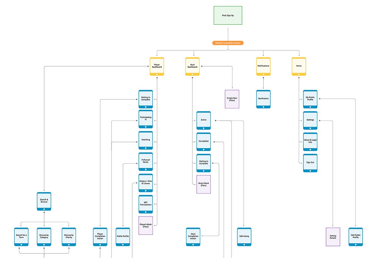
Rather than forcing both audiences into a single experience, the product was intentionally designed around two distinct but equal spaces:
Players (buyers)
Hosts (sellers)
This separation allowed each group’s needs to be addressed without diminishing the other, while still maintaining a cohesive overall system.
User flows mapped:
Onboarding paths
Core actions and decision points
Raffle discovery and participation
Raffle creation and management
These flows evolved iteratively as assumptions were tested and refined.
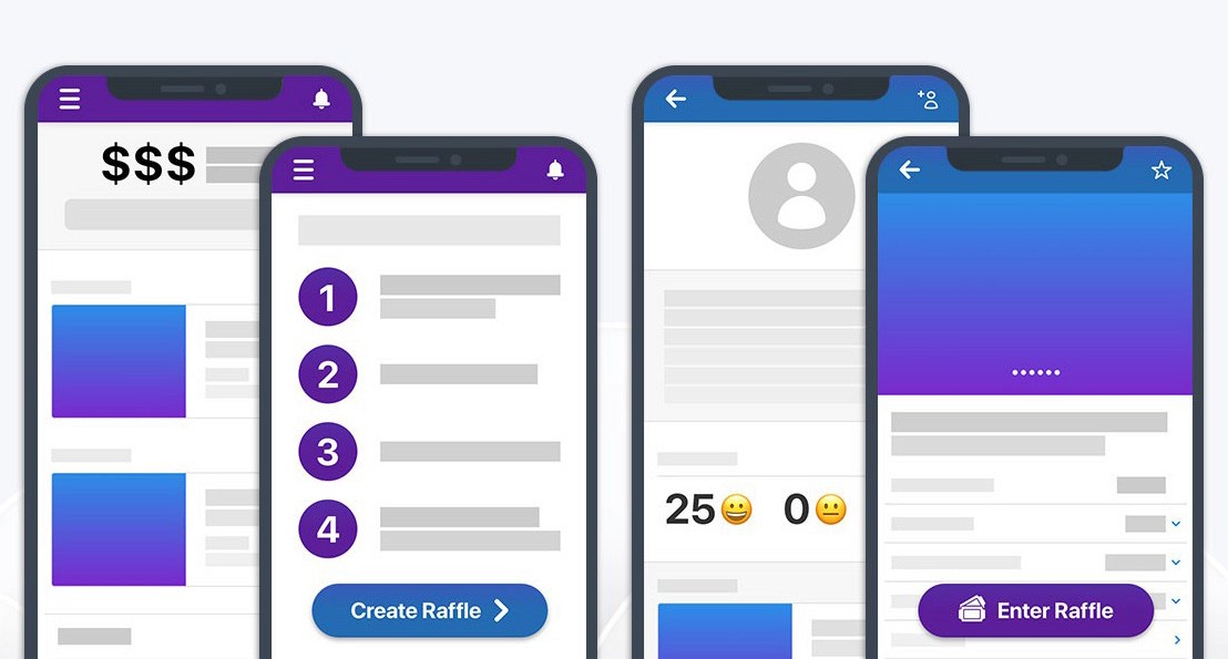
Wireframing & Early System Thinking
Sketching and wireframing focused on reducing friction and establishing consistent patterns early. Even at this stage, system-level decisions were being made — particularly around how lists, navigation, and repeated elements behaved across the app.
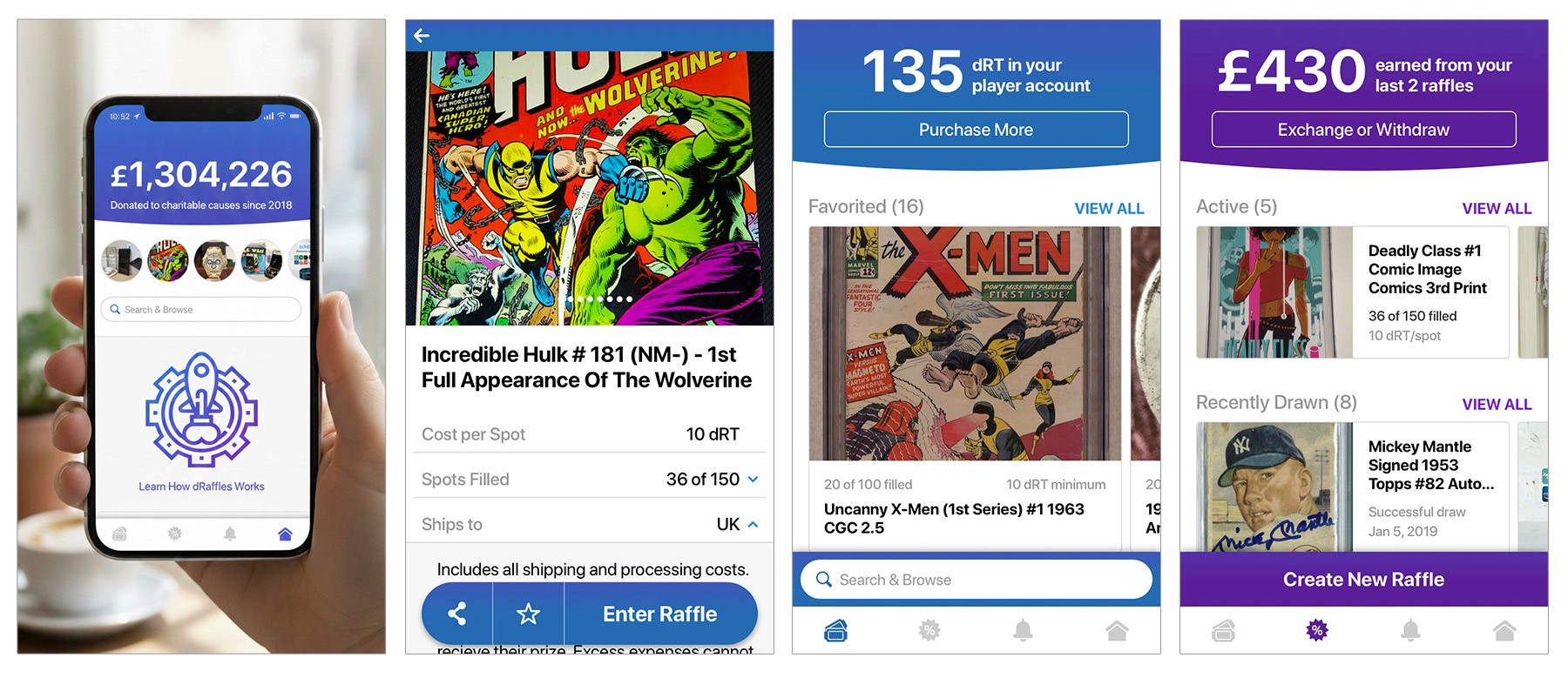
Player Dashboard
Early dashboards surfaced essential information but missed a critical element: token visibility. Making token balance immediately visible — along with a clear path to purchase more — became central to the experience.
Search & Browse
Instead of dedicating permanent space to browsing categories, search and discovery were consolidated into an overlay. This preserved screen real estate and prioritized what mattered most in an early-stage marketplace: what was available right now.
Navigation & Interaction Refinement
Visual design influenced UX decisions throughout the process. Early header-based navigation felt dated and ergonomically inefficient on mobile devices.
Transitioning to a bottom tab bar:
Reduced thumb travel
Improved discoverability
Unified role-specific and neutral areas
This change improved both usability and visual cohesion.
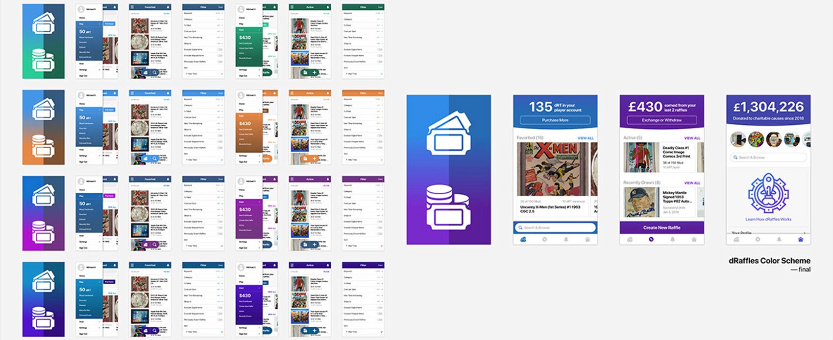
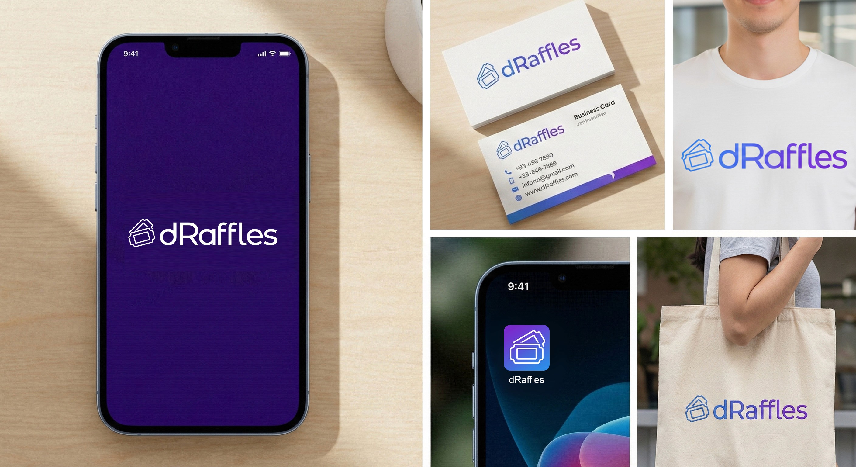
Branding & Visual Identity
Branding played a critical role in reinforcing trust and clarity.
The visual identity needed to:
Feel credible in a decentralized context
Avoid the visual clichés common in crypto products
Support clarity rather than spectacle
Color became a primary structural tool. Separate but related color families were introduced for hosts and players, helping define context and intent without relying on labels. Analogous color schemes were chosen to create smoother transitions, neutral shared spaces, and visually pleasing gradients throughout the UI.
Typography, spacing, and visual hierarchy reinforced readability and calm — supporting the idea that users should quickly understand rather than interpret.
Key Insights
1. Brand and product clarity are inseparable
Trust was communicated as much through tone, color, and visual restraint as through functional features.
2. Separate experiences reduce cognitive load
Designing distinct but equal spaces for buyers and sellers clarified intent without fragmenting the product.
3. Color can communicate role and context
Thoughtful use of analogous color systems reduced the need for labels or explanation.
4. Investor understanding requires experiential design
Interactive prototypes conveyed value and potential far more effectively than technical documentation or abstract explanations.
5. Systems thinking pays off early
Establishing consistent patterns and early system foundations prevented fragmentation as the product evolved.
Outcome
The collaboration enabled dRaffels to move from an early concept to a fully realized beta product.
By working as an embedded design partner within the team, Parallel² contributed directly to the creation of a live, user-facing platform that could be tested and validated in real conditions.
The beta launch demonstrated strong early traction, with high user engagement and multiple raffles successfully completed, resulting in positive experiences for both sellers and participants.
Following this validation, dRaffels attracted external interest for its underlying blockchain technology and was ultimately acquired by a competitor, who integrated the technology into their platform.
Key results included:
End-to-end product development from concept through beta launch
Embedded design collaboration within an agile product team
Strong early user engagement and platform activity
Successful real-world transactions across the marketplace
Pre-seed funding secured to support development
Acquisition by a competitor, validating the value of the product and technology
Reflection
This project highlights the importance of aligning strategy and execution from the outset.
By embedding within the product team and working iteratively, Parallel² was able to help dRaffels move beyond abstract ideas and into a tangible, testable product. The result was not just a clearer vision, but a working experience that validated both the concept and its potential in market.