
Ledgerly
Scaling Design & Systems
Building a scalable design foundation for a crypto tracking product and growing team
Early-stage startup exploring a decentralized alternative to traditional collectibles marketplaces, focused on peer-to-peer raffling.
Services Provided
Design Systems
Design Process & Mentorship
Team Growth & Strategy
Ledgerly was being developed by a small, focused core team working on a new cryptocurrency tracking application. At the time of engagement, the team included a single in-house designer who was responsible for the product’s visual and interaction design.
While the product itself was still early, the team was already thinking ahead. They planned to grow the design function, add contributors, and scale the application over time. Rather than accumulating design debt and inconsistencies, they wanted to establish a strong foundation early — one that would support both product growth and team expansion.
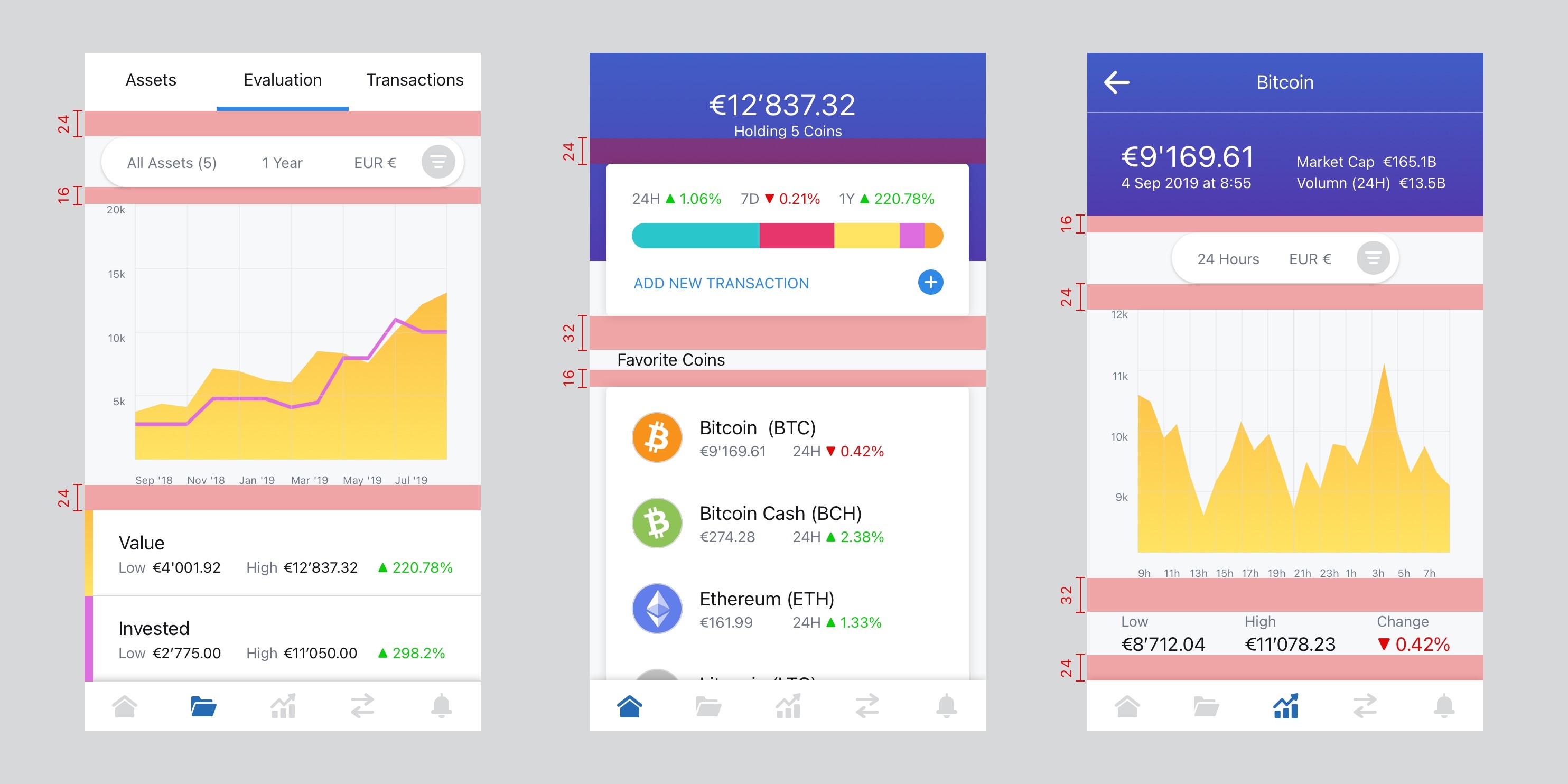
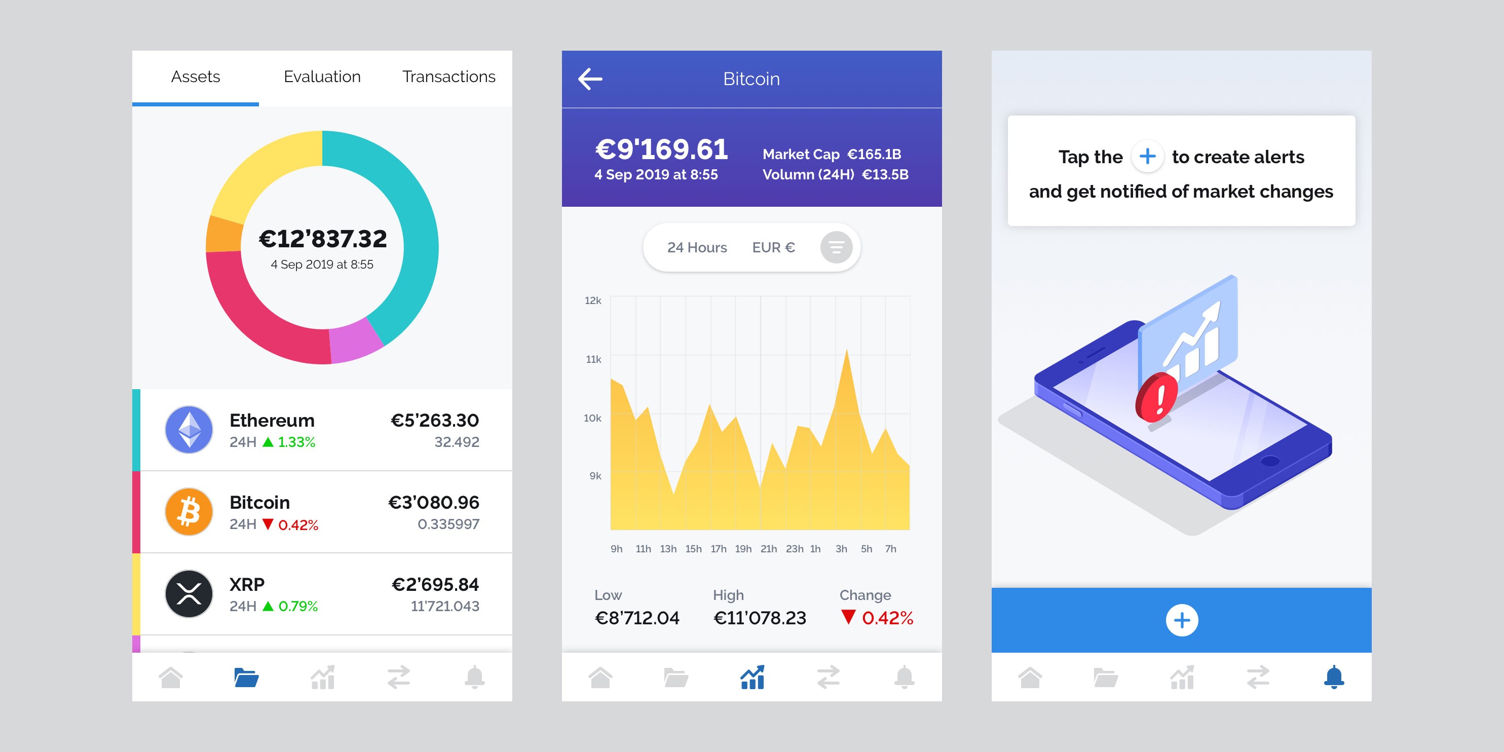
The product space itself added complexity. Cryptocurrency tracking apps are abundant, but many struggle with usability. They often overwhelm users with dense tables, tiny numbers, complex charts, and visually heavy interfaces. In contrast, Ledgerly aimed to make tracking time-sensitive financial information intuitive, readable, and pattern-driven — so that users could understand changes at a glance without cognitive overload.
The Challenge
The challenge was not simply to design screens — it was to design a system.
Ledgerly needed:
A scalable design foundation that could grow with the product
Clear design principles to guide future decisions
A component structure that reduced rework and inconsistency
Documentation that aligned designers and developers
A design team plan that supported hiring and onboarding
At the same time, the system needed to reflect a clear product vision:
after only a few moments of use, users should no longer need to search, learn, or interpret — they should simply understand.
This meant designing not just for the present UI, but for future features, contributors, and edge cases.
Our Role
Parallel² partnered closely with the Ledgerly team to lead the creation of a comprehensive design system while also supporting organizational readiness for design scale.
Our role extended beyond visual design to include:
Defining product and design principles
Structuring a scalable component architecture
Establishing documentation standards
Planning for design team growth and roles
Mentoring the in-house designer on systems, process, and long-term thinking
The goal was to leave the team stronger than we found it — with clarity, confidence, and a sustainable way of working.
Approach
Design System as Product Infrastructure
Rather than treating the design system as a static library, we approached it as product infrastructure — something that would actively shape how the product evolved and how the team worked.
The system was structured around four core areas:
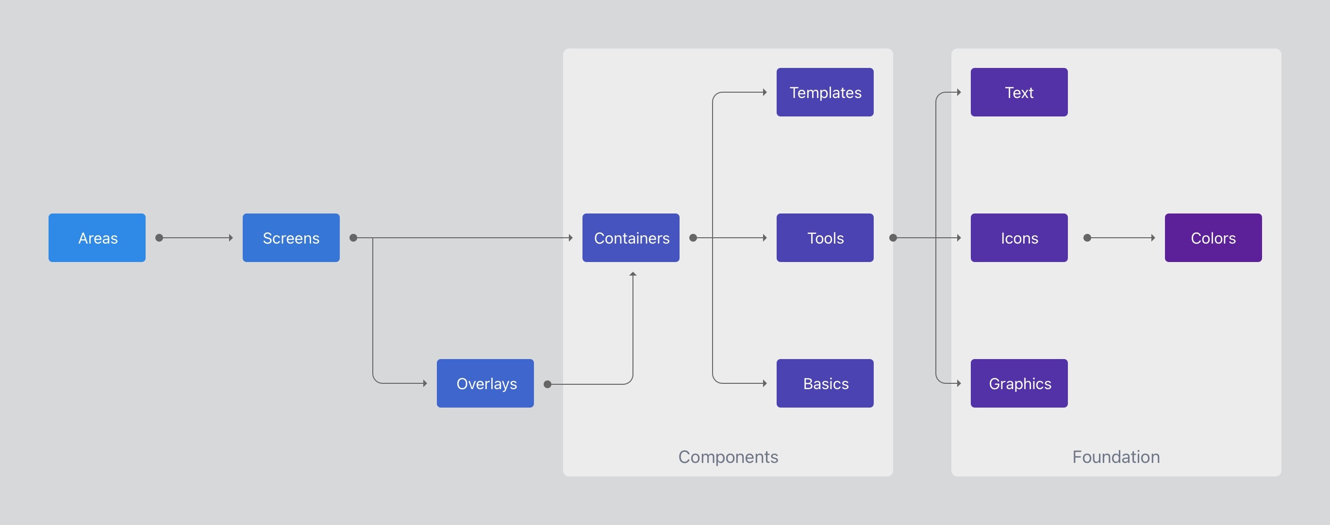
Principles
Product and design principles defined:
The overall direction of the product
The tone and emotional qualities the interface should convey
The standards the product should consistently uphold
These principles became a decision-making filter, helping designers resolve tradeoffs without relying on personal preference.
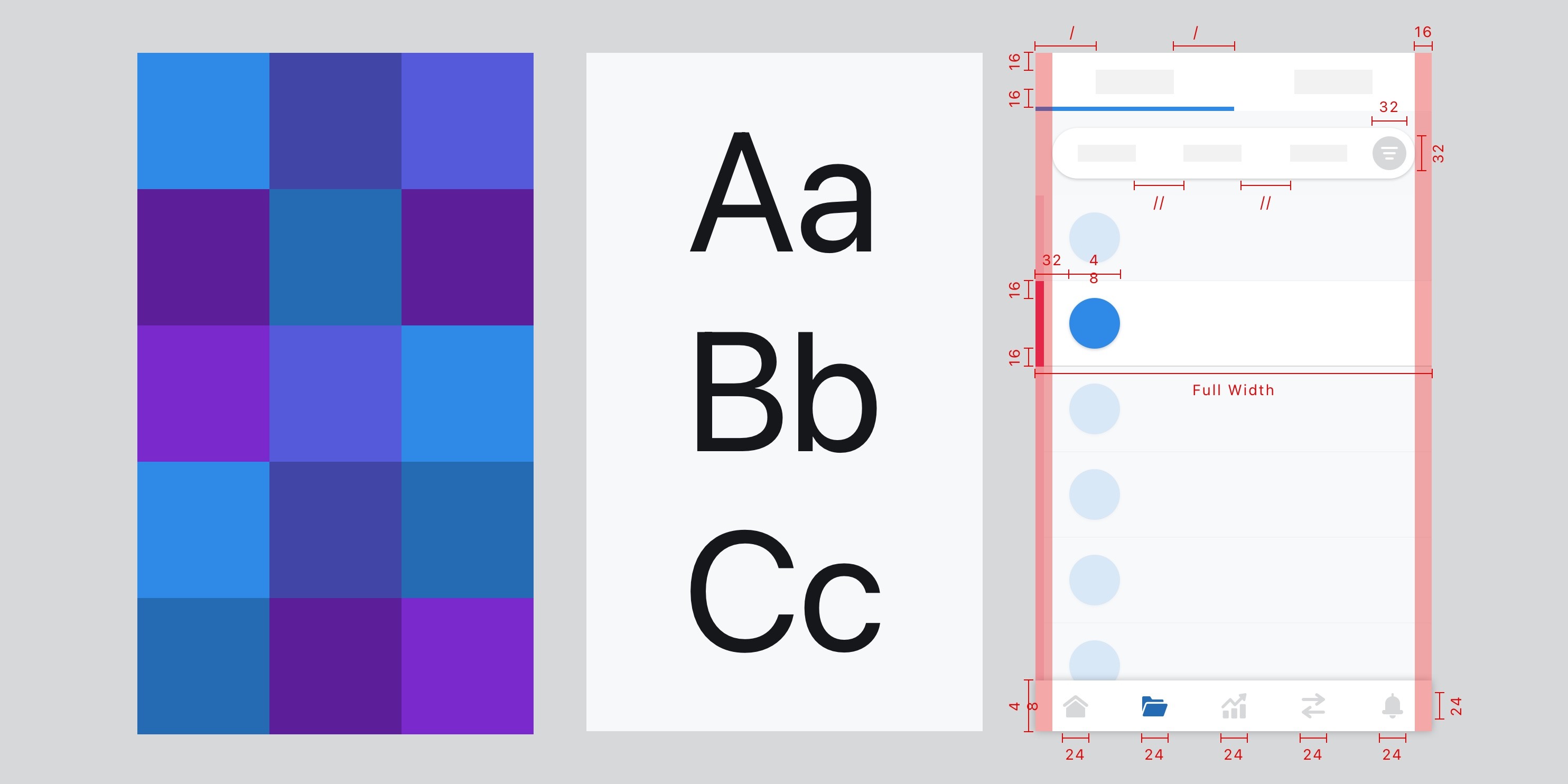
Foundations
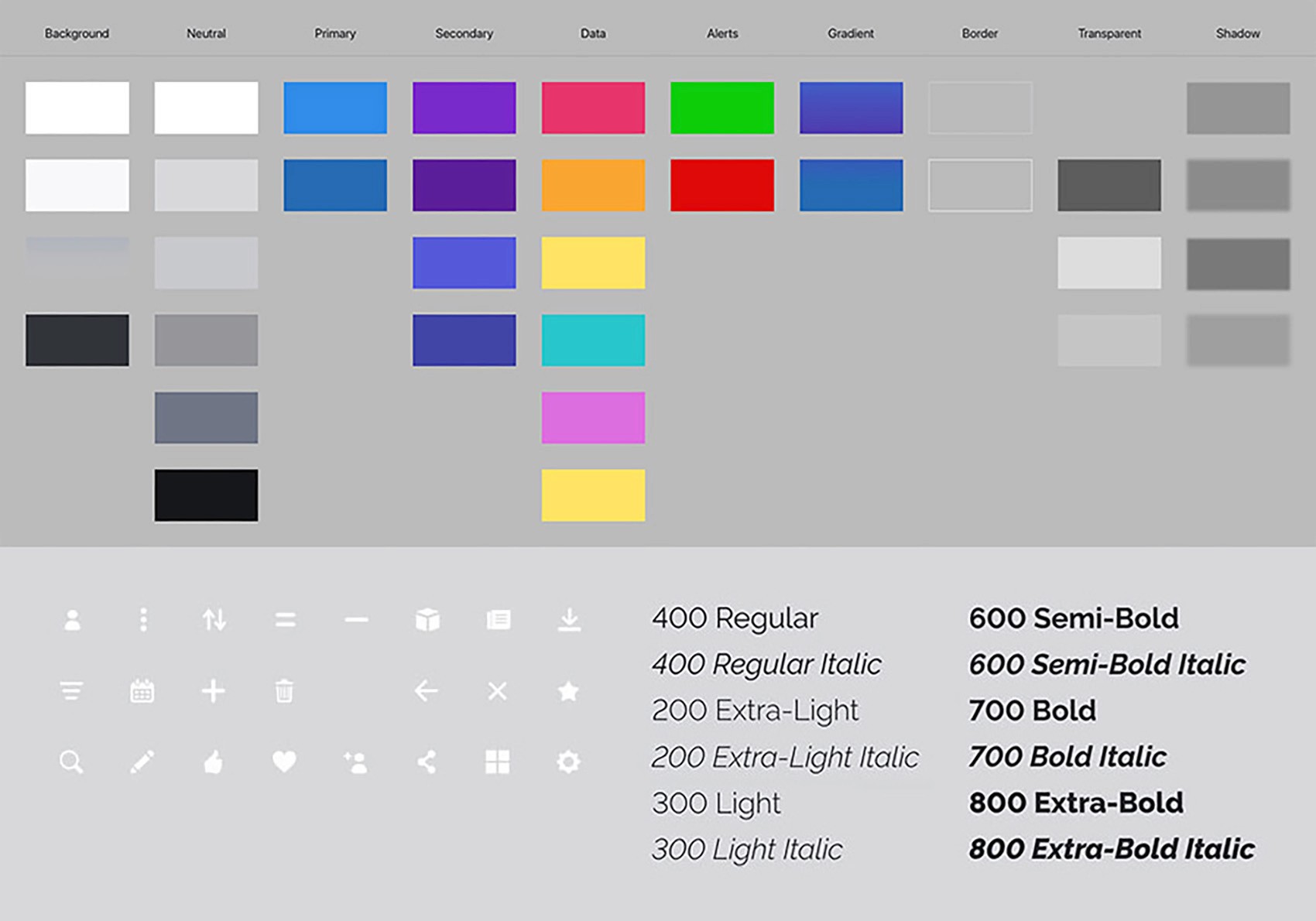
Foundations established the visual and structural baseline:
Branding and color usage
Typography and hierarchy
Layout rules and spacing
Grid systems and responsive behavior
This ensured consistency across screens while allowing flexibility where needed.
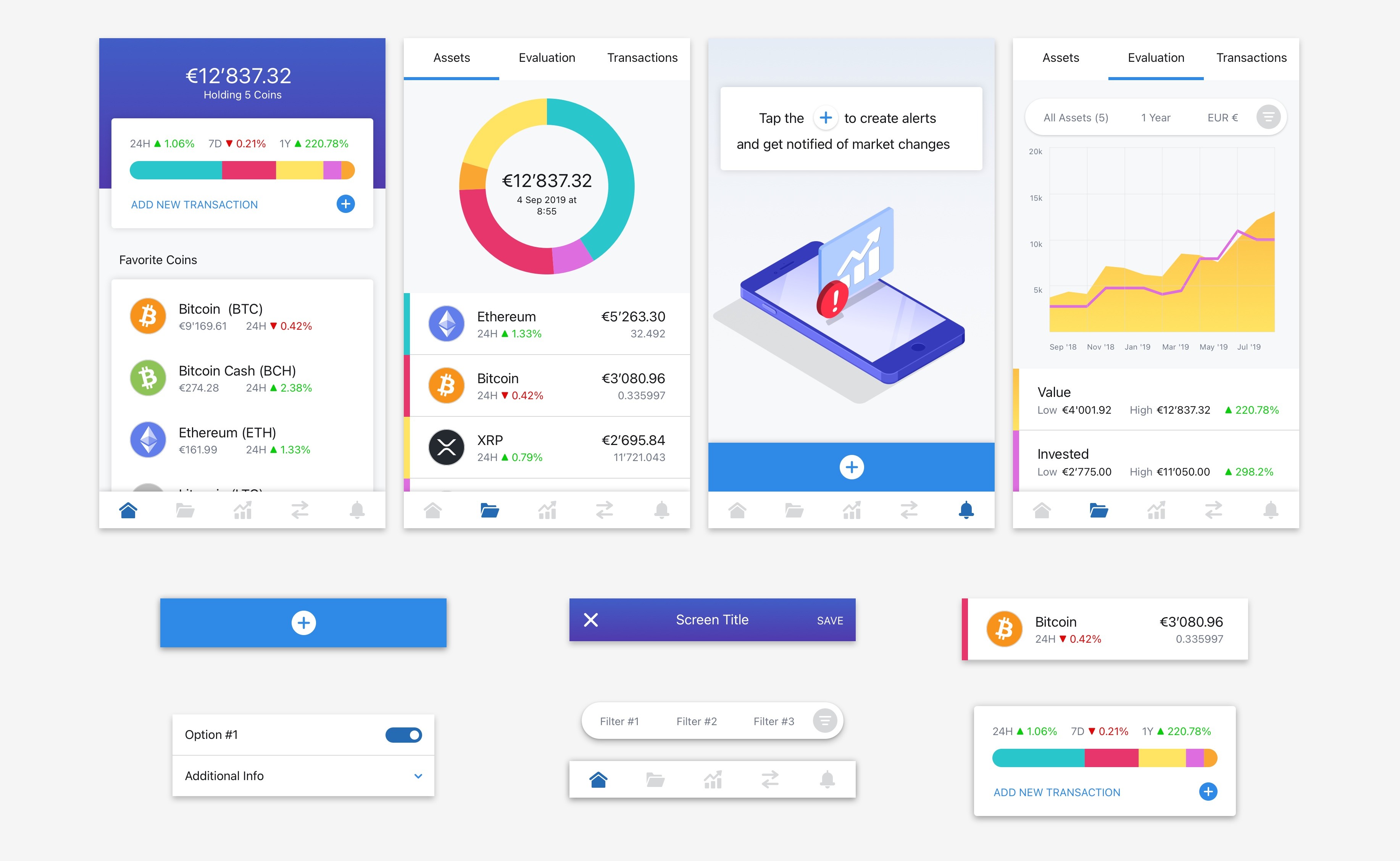
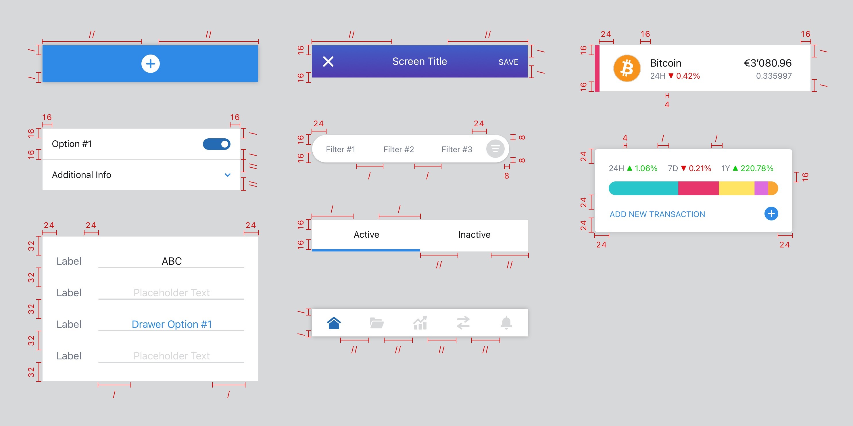
Components
Components formed the core of the system — the reusable building blocks used across the product.
Components were organized into three levels:
Basics — foundational UI elements
Tools — interactive and functional components
Templates — higher-level compositions used repeatedly across features
Each component was documented using a consistent five-part structure:
Preview — what the component is
Purpose — when and why it should be used
Rules — guidance on correct usage (Always / Never / Optional)
Examples — common configurations and variations
Specs — sizing, spacing, colors, and behavior
This documentation made the system usable not just for designers, but for developers as well.
Downloads
The system also included shared assets:
Icons
Images
Fonts
Ensuring that all contributors were working from the same source of truth.
Key Insights
Several important insights shaped how the system was designed:
1. Complexity is often a design failure, not a product requirement
Most crypto tracking apps overload users with data that obscures patterns. Prioritizing readability and hierarchy dramatically improved comprehension.
2. Systems matter regardless of team size
Even a small team benefits from a well-structured system — especially when growth is planned.
3. Reusable rules scale better than one-off designs
By defining flexible rules instead of fixed layouts, components adapted smoothly to unforeseen use cases.
4. Repetition is an opportunity
Frequently used elements — lists, form fields, graphs — were ideal candidates for systemization, reducing cognitive load for both users and designers.
5. Tone can drive interaction patterns
The system’s tone principles informed micro-interactions, including elements like sentence-style forms that felt more conversational and intuitive.
Outcome
The completed design system provided Ledgerly with a scalable, documented foundation for product and team growth.
Key outcomes included:
A fully documented design system housed in InVision DSM
A robust component library with shared styles and editable code
Clear UX and design principles guiding future decisions
Reduced design and development friction
Improved usability and readability across the product
A design team prepared to scale with shared standards and processes
The system allowed the team to move faster with greater confidence, while maintaining consistency and clarity as the product evolved.
Team Development
In parallel with system creation, Parallel² worked closely with Ledgerly’s in-house designer to:
Introduce system-driven design thinking
Establish sustainable workflows
Prepare for collaboration with future hires
This ensured that the system was not just delivered — but understood, maintained, and extended over time.
Reflection
Design systems are not about control — they’re about enablement.
By investing early in principles, structure, and documentation, the team created a product foundation that supports clarity, speed, and long-term value — for both users and the people building it.